fanbox
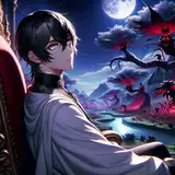
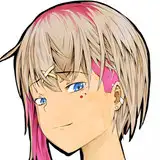
コントラストは低い方が馴染みやすくて良い気がしますが、どうなんでしょうか… I guess low contrast is better in terms of color brending,but I can’t tell which is truly right. PS : I found that it’s wrong for reality to paint with just one color.
TaigerArts
けると
Poudingue
Q13
1AMWolfram
Crispy Kimchi
Hanami
Cassinni4's Creations and Other Minecraft Addons
鬱勃起
Yaboyrocklee
monstersouls
tetupong
akai-melon
bigwolfcakebelly
lumirue
Shadow (the_shadow_rising)
wirai
egneva_designs
drawbauchery
Aelix
hozumi
Lean120
Hanxulzmods
whisperingsnow
vyrus smith
NTRking
RubberNinja
Balsyka
Sauce
Allure Diffusion
ReedReacts
milehighshred
きえるぴ
Blue
FLATWALL
samux
7559067910969
Hioyami
shane_nelson
marcelinhofeet
latenu
joonbob
link2004
syamiartist
sakana2
KaneAnimations
Zelest
sum
nirui
Ranyi(18+)